BY ‘ECK ITS GORGEOUS
We’ve always found Manchester to be a an aesthetically pleasing city. It doesn’t tend to feature in peoples’ top 10s like Dubrovnik or Venice, but seen through a Lowry-tinted lens it is a post-industrial gem. In the mid 1990s it was seen through a beer-tinted lens when Bartle Bogle Hegarty chose to give it a Venetian makeover on behalf of local brewer Boddingtons – the Cream of Manchester.
The advert is now a classic, with Anna Chancellor – or Gladys Althorpe – nicking what looks like an ice cream but turns out to be a pint of creamy Boddingtons from a gent gondolaing suavely past.
We still love that sleight of hand as much as when we first saw it, and that’s why we chose so many of its ingredients for our latest letter design, integrating the hops, the lipstick, the cone, the bee and the glass around a B for Boddingtons Brewery.
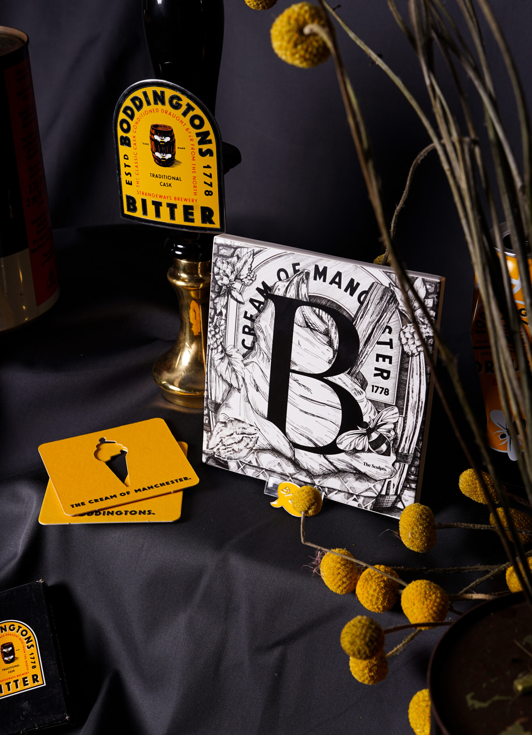


That particular advert is an early reflection of Manchester’s rebirth in the new commercial era. Down to earth, savvy, stylish, it celebrated quality local craft with a wry, self-deprecating humour. The identity that was emerging hadn’t been created in a London advertising agency, but it was perfectly captured by one, who saw the beauty and possibilities of those canals with abundant clarity. It’s all bottled neatly in the line ‘Cream of Manchester’. This is the very best of us, it says. Our canals are not living art galleries but they are a work of art.
Boddies was and is a cracking pint, and could never have spawned so many loyal drinkers around the world if it wasn’t. Countless Manchester factory workers have wet their whistles with one after a shift, and the company itself was a true pioneer, every bit the epitome of our beloved worker bee. From the impressive expansion driven by Henry Boddington when he bought what became the Strangeways Brewery to the widgets introduced to the can design decades later, it’s Mancunian industry in its element.
The canals used in the advert have enjoyed ongoing makeovers as part of this evolution too, creating some beautiful natural oases around the city. The Salford Quays is now one of the most vibrant and fast-growing parts of the region and the new Mayfield development has biodiversity as a core objective for the segment of river it will straddle.
Which makes it all the more sad and confusing that Boddingtons has gone a little out of fashion. In the age of boutique craft cans of citrus IPAs, creamy smooth beer – drunk in actual pints – is well overdue its own resurgence. If you’re listening, Boddingtons folk, we dedicate our latest creation to you. And we really hope you feel the same about it as Gladys did about her pint thirty years ago.
The Manchester Letters ‘B’ for Boddingtons
Purchase your Tile now