Time for the second instalment in the blog series exploring our A to Z Manchester-themed ceramic tiles – a dive into the history, cultures and landmarks that inspired each tile, and the creative process behind making them.
Next up is B for Boddington’s. The Boddington’s Brewery was founded in 1778, and quickly became one of Manchester’s most beloved beer makers, producing the famous creamy bitter we’re still enjoying two centuries later. The brewery’s iconic black and gold logo is instantly recognisable and with its worker bees and beer barrel has become a universal symbol of Manchester’s proud brewing heritage.
Our Manchester-themed ceramic tile features a unique pen and ink design inspired by the Boddington’s story. And whether you love our great city, love great beer, or just love classic advertising campaigns, it will bring something intriguing and distinctive to your home.
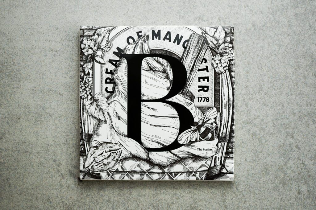

While Boddington’s Brewery proudly shows its 1778 date on the logo, it began life as Strangeways Brewery, Manchester, England. It was a fairly small operation at first, but the rapid expansion of the railway system allowed all breweries to begin distributing nationally. Throughout the 19th century thousands of beer-lovers took to their wetting with whistles with the creamiest ale in the country and by the turn of the 20th century, Boddington’s had become one of the largest breweries in the UK. Its reputation for high-quality beers – helped along by its famous logo – made it legendary. But the best was yet to come…
The 20th century proved to be a golden era for Boddington’s Brewery. With expansion continuing at pace, Boddington’s began acquiring a number of other breweries and opening new pubs throughout the country. By the 1970s, ‘Boddies’ was recognised as a cult brew around the north-west, but as a company it was now large and unwieldy and a fair amount of financial turbulence followed. This all changed in 1989 when Whitbread bought the brewery and brand for over £50m – and decided to have a chat with the Mad Men at Bartle Bogle and Hegarty in London. They went on to produce one of the most famous British advertising campaigns of modern times. Created alongside the introduction of a ‘widget’ inside the can (that enhanced the creaminess, apparently) the strapline Cream of Manchester propped up wave after wave of brilliant print and TV ads – the best of which we’ve paid homage to in our B tile.
There’s no doubt that the Boddington’s Brewery’s success helped to establish Manchester as a major industrial city, and exporting the city’s craft and values far and wide. And it was this industrial character that BBH played on to such great effect in their ads.
Much was made of Boddington’s creamy texture – as creamy as an ice cream – and the TV spot in question featured Anna Chancellor gondalaing elegantly through what looks at first like Venice. After sharing a look with a dashing bloke passing in the other direction, she reaches across and nabs his ice cream – which turns out to be a pint of Boddies, and the location the Manchester Ship Canal. She takes a hefty swig before wiping the remaining cream away with the back of her hand, along with her lipstick, and declaring ‘By ‘eck its gorgeous’.
Design Inspiration
This ad, and many more, propelled Boddington’s into the public consciousness like never before. Pre-internet, it was a viral video before such things existed. And since we have a particular soft spot for it, we decided to capture all the ingredients in our B tile, integrating the hops, the cone, the lipstick, the bee and the glass alongside an ornate B for Boddington’s.
For us it’s far more than just a tongue in cheek pop culture reference. The brewery, its beer and its advertising campaigns perfectly reflect the story of Manchester itself. From humble origins an industrial behemoth was born, that kept one foot in its working class heritage whilst placing the other firmly in the world of mega-bucks business conglomerates. The campaign’s ability to tread the same line – straddling industrial grit and chic, slick creativity – is why it worked, celebrating itself without taking itself too seriously.
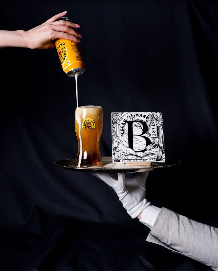
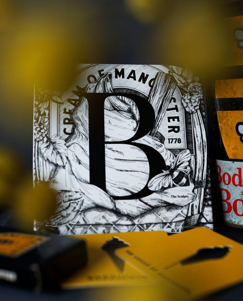
All The Sculpts Manchester-themed ceramic tiles are made with pride, and feature our signature illustrated designs all the way from A to Z. Each one is crafted with careful attention to detail in the print process, to give a high quality homeware product that looks fantastic in your space.
Like all our designs the Afflecks Palace tile was hand illustrated by The Sculpts founder, Richard Bennett using a fine pen and ink technique. This A tile design is printed then applied to the pre-glazed tile before kiln firing at 850°C. This process ensures the glaze sets properly and becomes permanent.
The full A to Z Manchester Alphabet tile series from The Sculpts is available to buy from a range of outlets, both online and in store. The quickest and easiest place to pick yourself up an Boddington ceramic tile is right here on our online shop.
We hope you’ve found this a useful insight into the story behind the Boddington’s tile, and our creative process. The next blog in the A to Z series is coming soon – D for Danger Mouse.